Sifting through every nook and cranny of 73 foundation websites is not fun.
On its face, that statement does not seem revelatory, but I really would not have thought about it much until the CEP research team started collecting data for our latest research report on foundation transparency. For part of the analysis in this report, we decided to look into what information foundations were sharing on their websites. We looked for everything from staff names to grant application deadlines to conflict of interest policies. You can check out some of our quantitative findings from this effort in Sharing What Matters: Foundation Transparency.
Websites are the public face of any organization and foundations are no different. In fact, 81 percent of grantees at an average foundation use the foundation’s website as a resource. If you are in charge of writing grant proposals at an organization that receives foundation funding, a foundation’s website can be an important resource for a whole host of information, such as funding guidelines, programmatic goals and mission statements to help frame funding proposals, and much more. If this is your role, you might have to take a deep dive into foundation websites to find this kind of information once a month. Maybe even once a week.
If you are in this group, I now know some of your pain.
While some foundations do a great job of making their websites accessible to grantees (grantees who use foundation websites rate their helpfulness a 5.59 on a 1 to 7 scale, according to our dataset of grantee perceptions), others seem like they simply are not willing to put the necessary resources toward making their websites friendly to those seeking information. In Sharing What Matters, we found that many foundations are not posting some potentially valuable information for grantees and the sector as a whole, including reflections on strategies that have been tried and not worked in the past and information about unsuccessful projects. This is unfortunate.
But while our report discusses what foundations are and are not sharing on their websites, it does not delve into how effective web design can make the information that is there as helpful and accessible as possible. We often found that even when foundations’ sites shared all of the information we were looking for, it often took an eternity to find. What we found on this topic did not make the report because we could not quantify it, but I wanted to share some of my observations here because I believe it can be important for funders to think about as they look at their own foundation’s sites.
Don’t Party Like It’s 1994
With how ubiquitous websites are today, it’s hard to believe that the first AOL disks only started appearing in the mail in 1992. We’ve come a long way since then. When General Electric became the first Fortune 500 Company to launch a website in 1994, the home page looked something like this:

Note the crazy color scheme, the amazing amount of grey space, the ambiguously worded clickable headers (and the quintessentially 90’s hairstyles). If you go to GE.com today, it looks more like this:
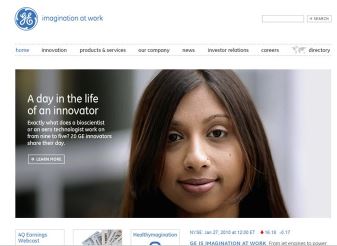
What a difference 20 years can make. I think we can all agree that the days of prehistoric websites should be behind us.
So imagine my surprise when I came across several foundation websites that looked eerily similar to GE’s 1994 website. Crazy formatting abounded, as did unhelpful headers. It’s a bad look for a foundation to have such an eyesore as a website, but the issues run deeper than simply visual appeal or aesthetics. Old websites are not intuitive to users because we’re used to interacting with more up-to-date layouts. Additionally, dated websites tend to hide information by accident because of the coding limitations of the day. I remember going to one foundation website where I could not click into the tab for one of the program areas. On another, I searched and searched and could not find the foundation’s mission statement. But when I accidently clicked on the foundation’s logo, up popped a page with — you guessed it — the elusive mission statement.
These types of websites are bad for users and are a bad public face for any foundation. Given how many people use any given foundation’s website, I urge foundations with an antiquated website to spend the money to get the site updated. It will be worth it and your grantees will thank you.
We Are Going Back to the Future
Speaking of updated sites, there’s been a wave of recently redesigned foundation websites that are so new age they look fit to be perused while riding in your self-driving flying car. I am not going to lie, these websites are chic. They are a positive and modern public face for the foundation, often including high resolution photographs and highlights from grantees’ work. These things are important, but it seems that this most recent round of website renovations might, in some cases, fall victim to prioritizing style over substance.
When going through most of these new websites, I often found that it was difficult to find important pages such as FAQs, grant assessments, and funding guidelines for specific programs. In many cases, the in-site search function did not work particularly well and I found myself stuck clicking through page after page trying to figure out where a piece of information might live. In fact, we found that 34% of foundation websites either had confusing page navigation or poor search functionality. Everyone wants to have an aesthetically pleasing external face for their foundation, but the content should match the flashy exterior. It’s important to remember that visually appealing web design is not necessarily good web design. Too many of the new foundation sites forget about navigability, and that can be frustrating for a grantee or any other website visitor.
Give The People What They Want!
You might think I’m pretty down on foundation websites, but I really don’t think they’re all bad. There is a happy medium. Take the Weingart Foundation, for example. They have created an intuitively-designed website that includes important information and is easily navigable. Same with the Andrew W. Mellon Foundation. Sure, both have attractive content sliders with slideshows of photographs, but they pair that with understandable top navigation panels and intuitive drop down menus. All of the most important content can be accessed straight from the home page. Mission statement: prominently displayed, no scrolling or clicking required. Staff directory: intuitively in the ‘About Us’ tab. Want to find out what they are learning from their evaluations? Try the ‘What We Are Learning’ tab. Need any information about grants? It is clearly laid out in the ‘Our Grantmaking’ dropdown so you only have to click once. This is what all websites should strive for.
What these foundations do, which is so important, is balance the importance of form and function. They’re not hard to look at, and while they do not include every piece of information they could, what they choose to share is easily accessible and well organized. So as you are thinking about what new information to put up on your foundation’s website after reading Sharing What Matters, make sure to remember that it is not only important to consider what you share, but also how easy it is to find.
Matthew Leiwant is a senior analyst on the research team at CEP. Contact him at mattl@cep.org.